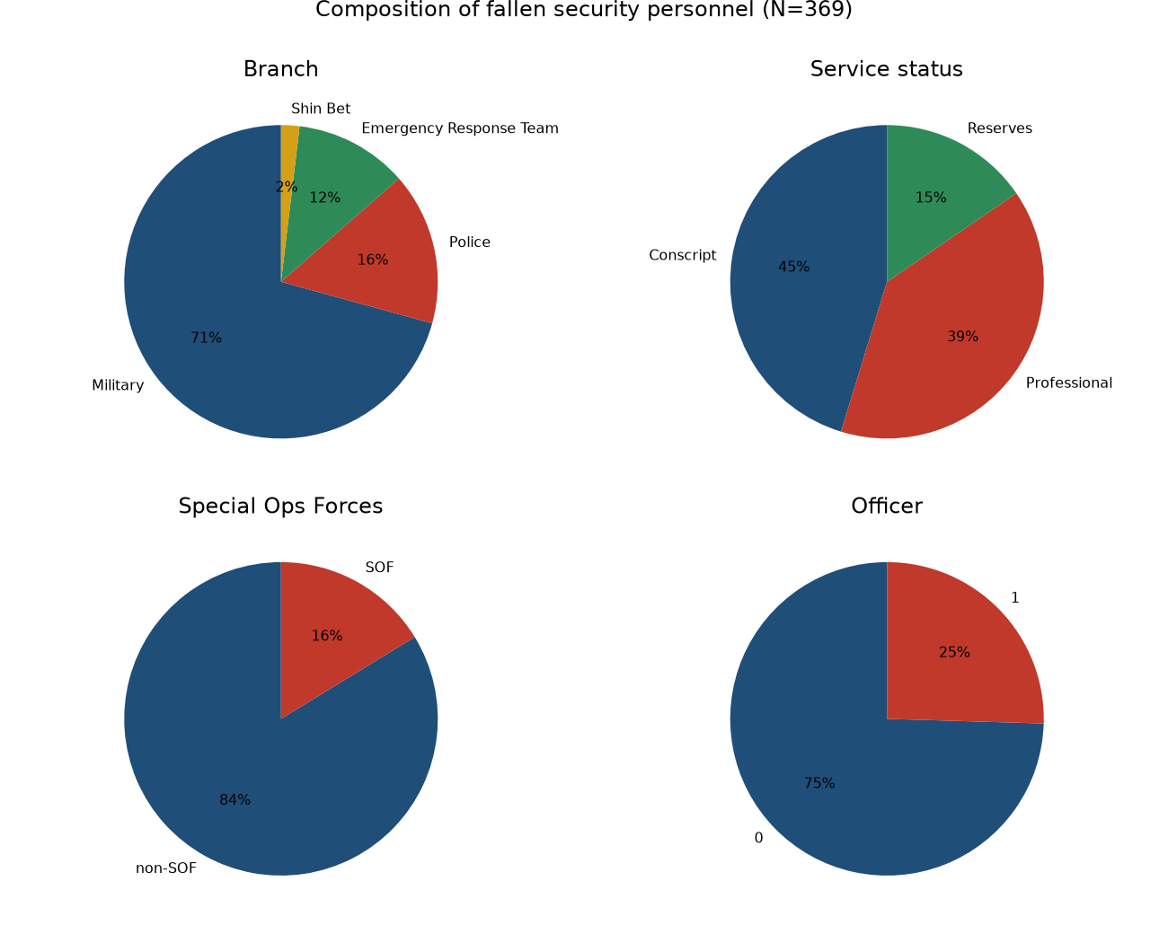
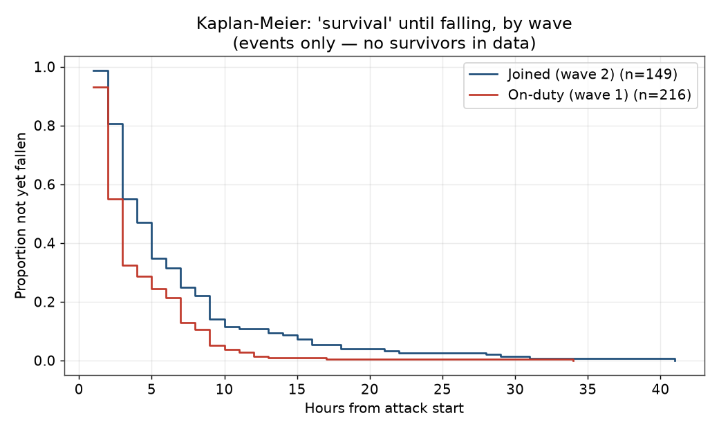
After the first phase of the attack, in which the forces stationed at the border fought, additional units and individual fighters appeared on the scene and entered combat on their own initiative — with no one managing the event. Among the responders there is a disproportionate representation of special-operations personnel. We argue that the security forces' partial success stemmed from “Embedded Response Capacity”: the ability to switch instantly from routine to crisis and to operate in the fog of war even when command-and-control systems are paralyzed.
The animation shows the fallen appearing, hour by hour, across the Gaza-envelope map. For full interactivity see the live map below. · ⬇ Download the video (webm)
Each circle marks a place where personnel fell; its size is proportional to the number of fallen there. Move the slider or press “Play” to see how the fighting spread in space, hour by hour from the start of the attack (06:29).


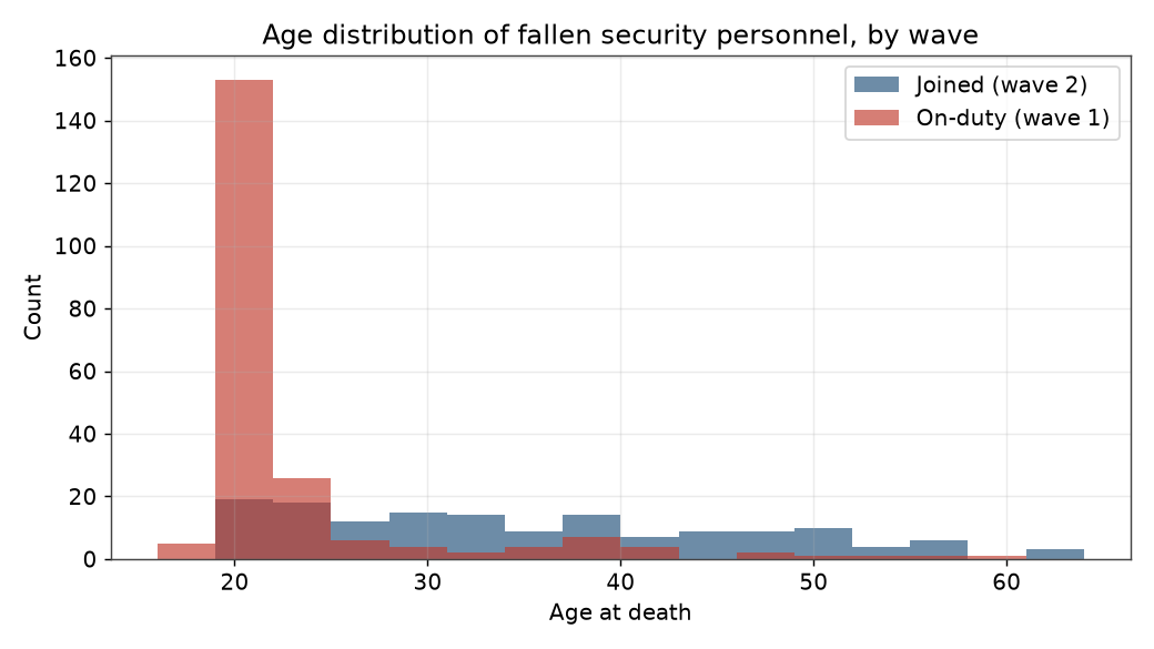
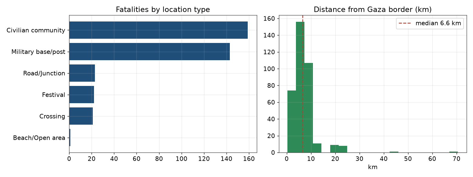
The dataset was compiled from official open sources (IDF, Police, Kan, Mapping the Massacre) and cross-verified. Ages were located from open sources (mainly Times of Israel obituaries) verified against two sources (367/369). Distance-from-border and unit hierarchy were computed from the data. The analysis includes χ²/Fisher, Firth logistic regression, Kruskal‑Wallis, Kaplan‑Meier and Cox, and an SOF bounding argument. The dataset grew out of an initial compilation of the fallen (182 soldiers, extracted from the government's Swords of Iron casualties page in October 2024), preserved in the repository's Evolving‑Paradigms folder.